
Do you usually pay attention to the letters you receive from companies upon registering for their services? These are welcome emails – the most important email the customer will get. The purpose of these letters is to get the customer to be excited about using the company’s services and to make a positive first impression of the company’s goods and services.
These are the reasons why emails should be a key part of your business:
Furthermore, a majority of entrepreneurs agree that welcome emails are a successful investment in their future revenue growth. Here are some statistics regarding the feasibility of emails to customers:
With these statistics in mind, you should certainly consider using welcome emails as part of your marketing strategy.
In this article, we have included 12 examples of the best welcome emails, and why you should use them as examples for your company’s emails.
GoPro is a highly successful camera company that markets itself as a company whose cameras are for highly active individuals who engage in an assortment of fun, exciting activities such as surfing, hiking, and biking. As you can see in this welcome email, it captures the essence of how the company markets itself.
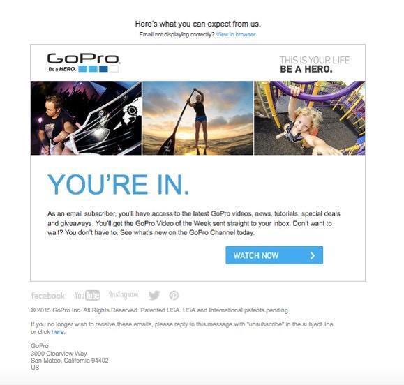 Look at the photos for thirty seconds, and then think about what you see. Starting from the left and working my way to the right, I see a ‘hip’ guy with people dancing in the background, I see a woman padding out into the ocean on a surfboard, and I see an early adolescent playing on a jungle gym.
These pictures tell me three things. Firstly, the picture on the left tells me that people who use GoPro cameras are ‘hip’ and ‘cool.’ The second and third pictures tell me that people who use GoPro cameras are highly active people of all ages. Finally, and most importantly, all three of the above-mentioned photographs are of high quality.
The message that the consumer is getting from the welcome email is that GoPro cameras are for cool, active people of all ages who want to take good, memorable photos that can be posted anywhere, from the wall of your living room to your social media accounts. The welcome email encapsulates this marketing message in one, short email, and thereby it re-assures the consumer that he is buying the right product.
When you are creating your company’s welcome email, you want to be sure that you can pack in your marketing message as concisely as GoPro did in theirs. One good way to do this, as you can clearly see, is by showing the results that can be achieved by the consumer if he uses your product or service.
Like GoPro, Airbnb is another highly successful company that has been able to market itself to young people as a hip and cool alternative to hotels, motels, and hostels, and other types of temporary accomodation.
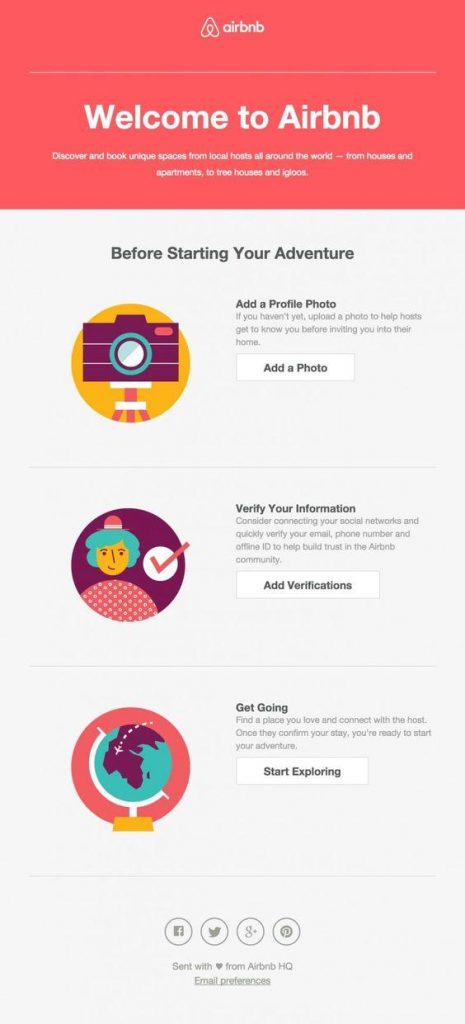 In this welcome email, one can deduce that the user has just created a profile, and that there are certain steps that the user needs to complete in order to create a full profile that is acceptable to the company.
The process of completing the profile is very straightforward, because the directions that Airbnb gives are concise and to the point. Everything that you have to do is outlined in three easy steps, and there are even pictures inserted into the email to help guide the customer through the process of creating a profile. Reading these directions is not like reading a maintenance guide and checklist that gives you a headache that lasts for weeks after you finish looking at it. These directions are direct, concise, and to the point.
In your e-commerce welcome letter, if there are a series of steps that the customer needs to complete in order to use your site, you would do well to follow the above example. If your directions are too detailed or long, you will quickly lose the attention of your customer and he may choose a different company.

Mr Porter is a posh, ecommerce clothing outlet selling a variety of items to both men and women. The key word here is ‘high-end,’ and you can easily figure out how high-end their clothing is by going to their website and looking at the price tags on the items they are peddling to online consumers.
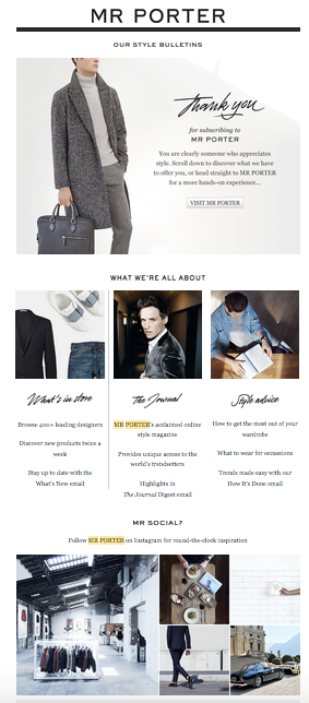 Another way you can tell that this is a posh company is by looking at the welcome email design of the e-commerce letter. In addition to the photos of handsome men wearing trendy, fashionable clothing, you will also notice that the lettering in the email is written in cursive. Cursive handwriting shows a mark of refinement on the part of the person doing the writing, not only because it makes the writing look nicer, but because we associate cursive handwriting with classical writing, a style we associate with good taste. By stylizing the text in this manner, Mr Porter is telling the consumer reading this email that if he wears their clothing, it means that he too is refined and posh.
If your ecommerce business is selling trendy clothing or antique furniture, or some other type of product that is supposed to lend an air of sophistication and elegance to a person or place, the content of your e-commerce email must reflect that as well. One way you can do this is by simply using the proper font for the text of your email.
Reebok, as popularized by athletes such as Sidney Crosby and Emmet Smith, has popularized itself as a company from which you can buy the same type of quality athletic equipment used by the pros. Buying the same type of jock-strap and cup used by David Beckham is nice, but, as anyone whose played sports knows, that type of equipment is going to be expensive.
 Case in point, a full set of goalie equipment for ice hockey (leg pads, goalie skates, blocker, etc.) can cost someone well over $1,000.
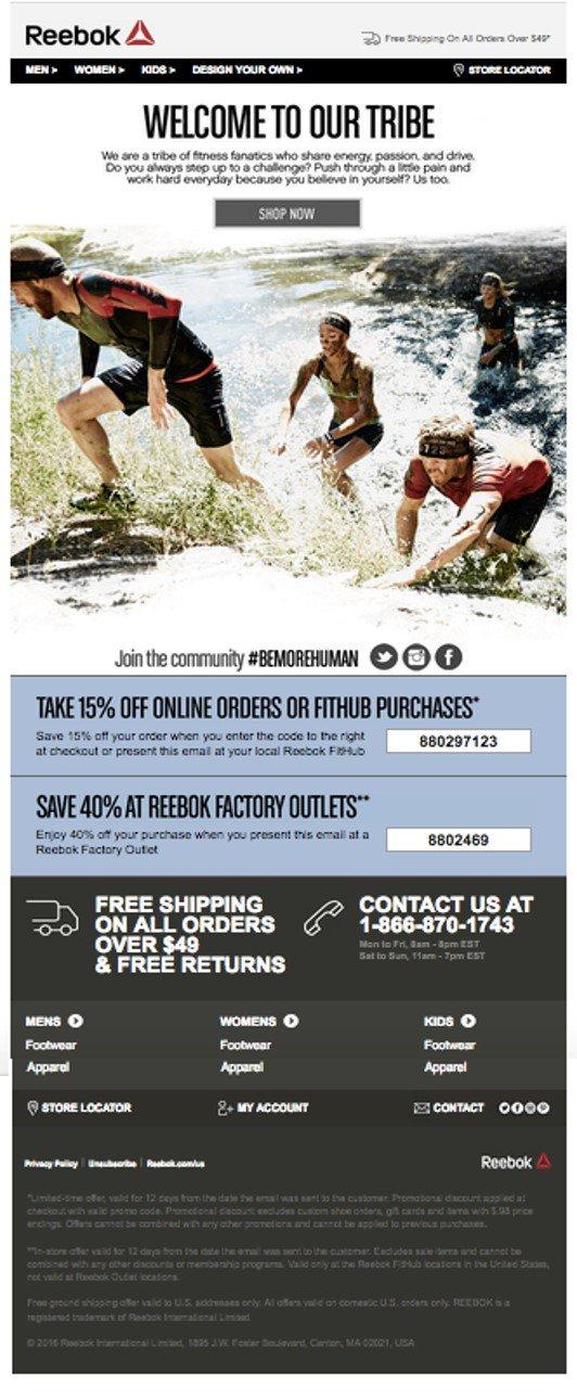
The marketers at Reebok know this, too, and that is why one of the first things you see in their welcome message is the opportunity take advantages of huge discounts. Three separate times in this email, you see the discounts of this company written down prominently in letters that contrast with the background, letting the consumer know that he has an opportunity to save money on new sneakers, jerseys, socks, or anything else he needs for the sport he plays.
If you sell expensive products, such as athletic equipment, in your e-commerce welcome emails to new clients, you should always display important information, such as discounts and promotions so that they are highly visible.
Another thing that Reebok did in this email is they included a ‘store locator’ function in the welcome email so that the new customer can quickly find one of their outlets and get whatever athletic equipment he needs.
If you are running a brick-and-mortar business, be sure to include a link to Google Maps so that the customer can easily find and drive to your location.

Nothing is more annoying than being subscribed to an email list that you cannot unsubscribe from, or that continues to send you emails after you tell them that you are no longer interested in their services. The emails just continue to pile up in your inbox, and it makes it harder for you to find emails that are important.
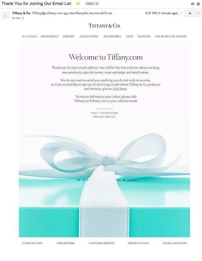 Tiffany & Co, in their email, offers its customers a chance to remove themselves from their email list by providing customers with a hyperlink that redirects them to a page where they can unsubscribe. By providing this option to their customers, Tiffany & Co are being considerate of their customers’ best interests and well-being.
You will no doubt have customers who will want to unsubscribe from your email list because they see your emails as nothing more than spam. Give these people an option to unsubscribe from your email list, just as Tiffany & Co does in their email. When they choose to unsubscribe, remove them from your company’s list of emails, and do not send them any more messages. Nothing is more aggravating than getting spam from a company whose services you stopped using.

The first thing you will notice about Amzon’s email, and all the others for that matter, is how easy it is to read the content. I am not talking about how well written the content is, I am talking about how well displayed it is.
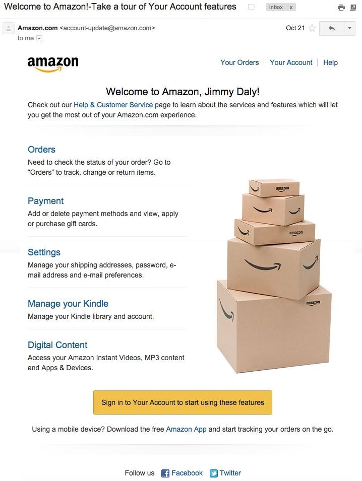 Notice how the icons, text, and photos so easily contrast with the white background. This makes is much easier for you to display content, it makes it easier for you to highlight the important sections of the email, and it makes reading easier on the eyes of the client.
In all of your emails to your customers, you should always display your content on a contrasting background not only because it make it easier for you to display your content, but because it makes it easier for the customer to read it.

There are many customers who do not feel comfortable dealing with a business that does not list their physical location. The reason they feel this way can be for many reasons. They might think that the services are not genuine, or they might think that there will be no way to return a defective product.
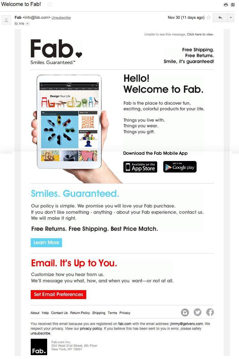 As you can see quite clearly, to the right of Fab’s logo, you see that the address of their business is clearly visible for all to see. This is something you should do, as well.
Always display the address of your business in your emails to your clients, and never withhold it from them. You should also consider including a phone number in your emails, too. Some customers prefer speaking to a live person rather than an automated system or trading back and forth endless emails with an anonymous person. Also, it is often much easier and faster to resolve a problem by phone than it is via email, live chat, or other communication mediums.
When a customer registers for a service, in his welcome email, he may not be familiar with how to use the service or product offered by the company. That is why, again, you should always provide your users with instructions on how to use the product or service they have bought.
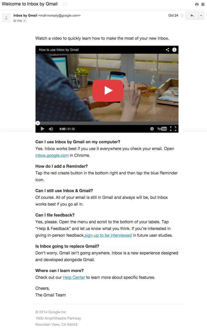 Your instructions, however, do not necessarily have to be steps written out for the customer to read.
In Google’s welcome message to new users for their email service, they not only provide their customers with written directions, they also provide their users with a YouTube video that provides the same directions in video form.
Many people like to go to YouTube in order to figure out how to do things, and you should take advantage of this in order to better the user experience for your customers.

Social networking has taken marketing by storm. Every business, whether it is e-commerce or traditional brick-and-mortar, has someone, or several people, that engage in social media marketing. That is because more and more consumers are turning to social media to make decisions about what to buy and what not to buy.
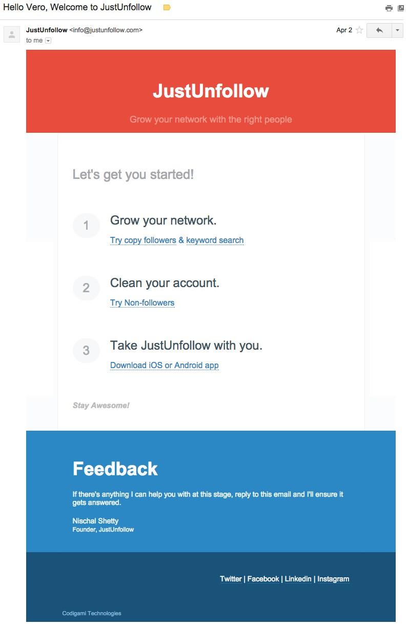 The executives of JustUnfollow know this, too, and that is why at the bottom of the email they have included links to their Facebook, Twitter, LinkedIn, and Instagram accounts.
Additionally, people who have email accounts often get more and more spam the longer they have that email address, so they tend to start ignoring the majority of the emails they get. They might start ignoring your emails, too, and they might stop using that email address altogether. If you have social media accounts, however, you have an alternative method of reaching your customers. That is why you should always include links to your social media accounts in your emails.

We have all seen ‘loud colors’ in use everywhere, especially by road workers doing routine maintenance on highways and county and farm roads all across the country. What colors are they wearing? More often than not, they will be wearing something that is red, orange, or yellow.
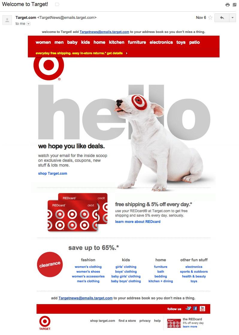 Why is that? That is because these colors are highly visible and noticeable, meaning that you are more likely to see them as you are driving and slow down to a safe speed.
This principle works in marketing, as well. Whenever you are driving, and you are passing billboards left and right, you are more likely to notice one that is using a loud color, such as orange, red, or yellow, than you are a billboard using colors such as blue, purple, or black.
Target used this strategy in their ecommerce emails, too, and for good effect. Unlike other emails, when you open this one, you are going to spend more time looking at the content simply because of all the loud colors it uses. This is a very clever marketing tool to use in your emails to clients.

When customers get welcome emails from the company the shop with, they want to have a way to immediately get started. That is why you should always include a link in your email that sends the customer directly to the place on your website where he can conduct whatever business transaction he desires.
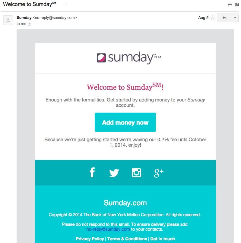 As you can see above, dead in the center of the email, and large enough for even a blind person to see, there is a link there that loudly says “add money now.” This is a very no-nonsense email that gives the customer the opportunity to get on with his business quickly without having to sift through tons of text and links that serve no purpose other than to annoy him.
In your e-commerce emails, you should always include a link that is prominently displayed in the center or at the top of the email that takes the customer to the place where he can get started doing whatever it is he wants. Never hide these types of links in endless text or at the bottom of the email, because doing that will cause the customer to give up and you will lose him for good.
If you want your company to become a leader in the market, you`d better fill your welcome letter with feasible and informative content. In order to do that, start writing on your own. Or order a professional content on SameDayPapers – leaders on the market of essay and content writing.
There are a lot of clever ways to create e-commerce emails, and each of these screenshots we have provided you with are great examples to follow, because they do the following: they capture the attention of the users, they are concise, they are easily read, they provide pertinent information to customers, they include links to social media accounts, and most of them include contact information.
When you are creating e-commerce email templates for customers on your email list, be sure to follow the above tips so that you can be successful in your email campaign.
Author’s Bio: This post was written by marketing specialist Ryan Bronson. Ryan has been in the field of Internet marketing for quite a while and knows this sphere inside and out. In this post, Ryan has shared some welcome email letters that, in his opinion, are the best examples of what e-commerce emails should look like.