Ecommerce information architecture is the structure your site takes. How the pages are organized together.
“Information architecture is the process of organizing, structuring and labeling information so that it is both easy to find and use.”
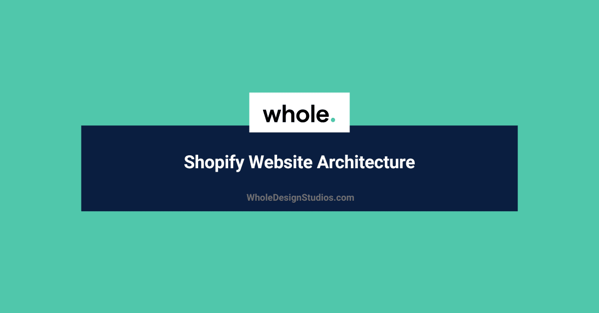
The easiest way to think of a Shopify sites structure is to group page types.
The most important rule of thumb for information architecture is the KISS principle.
“Keep it stupid simple”
The Three-click rule says:
“A user of a website should be able to find any information with no more than three mouse clicks”
That means we want to limit the depth of our sitemap to three clicks or even two.
For example to visualize site depth we can use breadcrumbs:
Homepage > Collection pages > product pages
This would be the best case scenario for your ecommerce sitemap.
Of course if you have a lot of SKUs you may want to add in sub collection pages:
Homepage > Collection pages > Sub collection pages > product pages
If you want to use a visual tool to plan your sitemap I recommend Writemaps. Simple and free for 1 sitemap so no need to subscribe or pay. Here is an example of the best case scenario created in Writemaps.
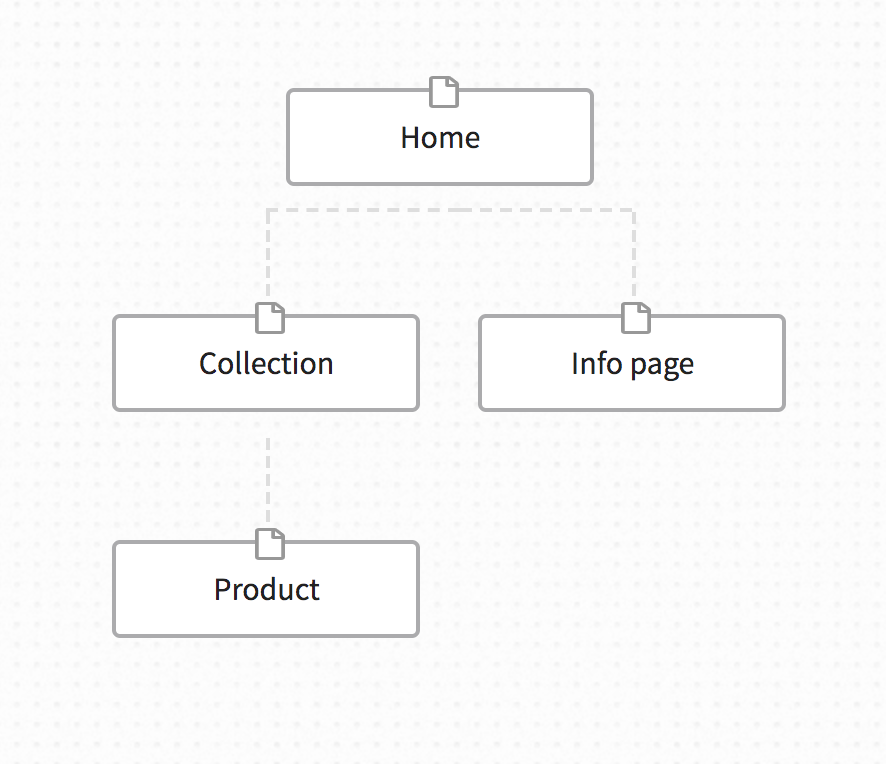
If we add in some example URLs for our boxer shorts Shopify store it could look something like this:
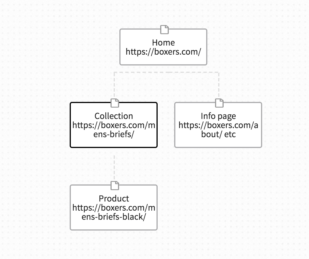
Sadly this is not the way the Shopify URL structure works. So let’s recreate the above sitemap as close to perfect as possible with Shopify URL structure.
The downside from an SEO perspective here is that the URLs for collections, products and pages are not ideal.
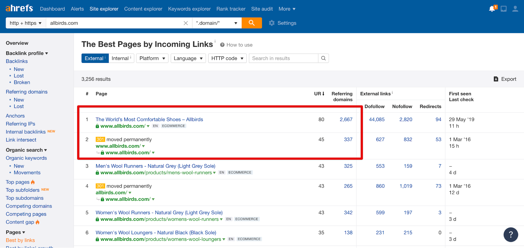
You see, most of your backlink will point to your homepage, let’s take a random Shopify store as an example, All Birds.
You can see they have 3-4k domain backlinks (great work!)
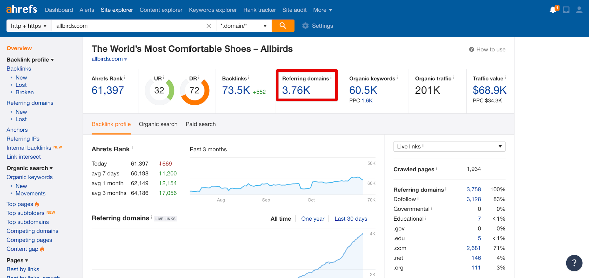
Around 3k point to the homepage. That’s 75% of backlinks!
The link juice is then passed down from the homepage to the collection pages and then (the sub collection pages if you have them) and then the product pages.
So if you have a very deep website structure the link juice is diluted too much by the time it reaches your product pages and you they won’t rank.
So for Shopify to have the additional layer in their URL structure that defines the page type or taxonomy (pages, collection products) causes the link juice to be diluted as it’s passed to the pages.
Aside from structuring your collections or taxonomies you also need to think about ontology.
If taxonomy is the arrangement of topics into a hierarchical structure. In ecommerce this translates into assigning items to one or more categories.
Then ontology is assigning topics into structures that explain the relationship between pages.
For example related products or related categories.
Ontology is important because in information architecture we are not only thinking about structure we are also considering navigation.
Your Shopify site structure should be beautifully balanced between SEO best practices and usability best practices.
We have to care about findability, discoverability, and usability as well as SEO.
Here are some examples of functionality you should consider for navigation, filtering and search to improve usability as part of your information architecture:
If you have a large number of SKUs then you need to decide how to trade of between SEO and usability.
Best case for SEO would be a shallow sitemap, this means your filtering and sorting functionality must be well designed otherwise it is too difficult to filter and find the right products.
Best case for usability would be sub categorization into sub collections. At the same time ensuring the sitemap is not too deep as to dilute SEO juice.
And don’t forget about the role of vocabulary and copy in naming your navigation links.
When it comes to naming your collections you can look at past historic site search data in Google Analytics.
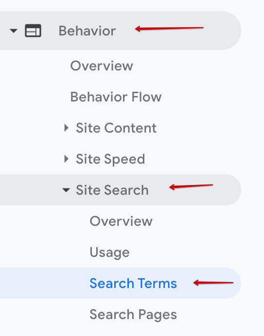
Then review the terms people search. The most commonly searched for short tail keywords are good candidates for collection names in your top level category menu.
You also need to cross reference your SEO keyword research for collection pages with this search data to make sure your H1 includes the correct keyword.
For labeling content such as page headers, make sure headers are large enough to be clearly visible when landing on collection pages. This will help reduce bounce rate and increase dwell time. This will in turn improve your SEO rankings and PPC ROAS.
If you are unsure how to group together your collections, for products catalogs that are trickier to segment you can use a methodology from UX called card sorting.
This simply means you have your end user or potential customer sort out all your products into piles or collections as they see them. A user data driven approach to creating and assigning taxonomies.
The fastest way to perform a card sorting user study is to use an online tool.
Once you have decided on your collections and site structure we can jump back into your ‘Chosen keyword’ tab and assign each product to its respective collection.
Giles Thomas
CEOOptimize your Shopify conversion rates. 5 lesson course, learn 51 ecommerce best practices to get more visitors to buy.