May I ask a small favor? Google pop ups. I bet you will see results like, “How to block pop ups” or “5 easy steps to stop pop ups.” Are pop ups really that terrible? If yes then why do so many retailers and marketers keep using them on ecommerce websites?
Errr, maybe because they actually work. Yes, it is admittedly disturbing when you’re minding your own business and scrolling down an online store and all of a sudden a page blocks your view. BUT people read what’s written on them and they do follow the directions of the pop ups. “Of course I want 50% off.” You don’t have to take my word as an absolute truth but statistics don’t lie: pop-ups have approximately 2% click through rate, which is a pretty good result compared to ads.
Use or not to use – this, right here, is one of the biggest dilemmas of ecommerce marketing. The end goal of ecommerce marketing is conversion and email pop ups interfere with it, so it’s make it or break it. Do you want to only “make”? Well, you probably want to stick around until the end to find out in what ways pop ups can help or hurt your ecommerce conversions.

How about we do a quick overview of the pluses and pitfalls of email pop ups, before we dive into explanations, reasons and solutions?
Email pop ups are advantageous because:
Voila – easy and affordable. However, they have drawbacks too:
I know it’s too much to absorb, so we will break down each point and discuss them in detail on a case by case basis.

First things first, let’s clarify the main purpose of email pop ups. I am sorry if you’re expecting a brand new piece of information that will blow your mind because the answer is simple and easy to guess – collect emails.
Just recently Emarketing surveyed 254 of the best retail professionals in the US and according to their data, 81% and 80% of respondents, respectively, noted that email marketing drives customer acquisition and retention. 80% … wow, it basically means that the vast majority of professionals find emails an effective channel to communicate with customers.
The bottom line is that email list is a powerful weapon and I am saying this in the most positive way possible. If you can get your hands on the emails of the users that visit your websites, it means you can reach out to them directly and convert them from a user into a customer. I know what you’re thinking, social media is also essential and people spend way more time on Facebook and Instagram than their emails – why not ask for their profile links? Good point, well done but here is the catch: emails are direct and personal, there are no side distractions. There is a lot happening on Facebook or Instagram in addition to ads – messages, notifications, posts on your wall makes it harder to make users stop and focus on your ad. Email lists give you access to a lot of people and you can send them e-letter about new offers, sales or in other words, newsletters both promotional and non.

Now that we are crystal clear about the need or dare I say, the must of emails in ecommerce, it’s time to get back to the role of the pop ups. Any email list doesn’t work as well as that of users who actually visited your website.
Email pop ups allow you to collect the emails of your visitors and continuously update that list. Email addresses are powerful tools that are used outside of email marketing. You can use the email list to make Facebook lookalike audiences and have better targeted social media campaigns.

We have reached that point of the article where examples make much more sense than me writing fancy and complex sentences. Let’s take a look at exit intent pop ups. In case the term doesn’t ring a bell, exit intent pop ups appear when you’re about to close the tab.
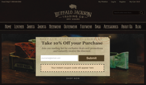
Say the customer added items on his shopping cart but didn’t make a purchase. As soon as he clicks on “close,” a pop up comes up – something like this one from Buffalo Jackson:

Considering that 67.45% of shopping carts remain abandoned, this is a good technique. There is more to the story, you can use the information about the customer and its preferences to send personalized follow up cart abandonment emails because your final goal is … exactly, conversions.
Some marketers choose to set up nanobars. Those are the small notification bars either at the top or bottom of the website that can be closed. Nanobars are convenient because they don’t interfere with the user’s experience. The only concern is that they may cause the website load slower, which affects the rankings. Speaking of which…

The title spoiled the plot – of course pop ups have pitfalls and rather serious ones. Not to bore you with unnecessary introduction, I am jumping right into the ways, pop ups can hurt conversions.
Ranking is extremely important because it leads to traffic and the less traffic, the less conversions. There are a number of factors that search engines take into account such as loading time, content, keywords, etc. pop ups, exit intent in particular, increase the loading time, which negatively affects the ranking of the website.
The darling of marketers (oh well, basically everyone) Google has recently announced about an algorithm change. Starting from January 10, 2017 mobile pages with interstitials, in human language pop ups, may rank lower. Google says this is for the sake of improving user experience. They actually do have a point because pop ups can be annoying especially on a phone screen. A bunch of SEO specialists identified may as the keyword. Google is not going to strictly rank each and every page low. But then again it’s Google, they don’t shine with their precision. As the saying goes, better be safe than sorry.
I am not sure if such term exists, it should if it doesn’t but that is not the point. Some ecommerce websites show you a pop up as soon as the page is loaded. Not the best strategy to reduce the bounce rate. You want users to stay as long on your page as possible so that you can convince them to make a purchase. Instead, an instant pop up blocks their screen and doesn’t let them navigate. What’s worse than this? I’ll tell you exactly what – pop ups that you can’t close for a certain amount of time. User experience is extremely, I’ll repeat this, extremely important. One-time purchase is not enough for my-work-here-is-done. The ultimate goal of ecommerce websites and applications is to have returning customers. Distracted prospective clients are no help in this case.
Webmeup published an article about annoying and irrelevant pop ups and here is what they found out:
“Wait a second, first you say pop ups are good then you say they’re annoying.” Hold your horses, there is a difference between pop up ads and let’s say shopify email pop ups. If the content of the pop up matches your website, (sales offer or deals) don’t appear immediately and can be closed then you’re good to go.

Look at that, you made it until the end of the article and hopefully pop ups make sense to you now. pop ups work, it’s undeniable, statistics say that, professionals claim the same thing. Yet, some users find them annoying as hell.
So… the big question still remains unanswered – should you use them or no? As an ecommerce marketer, myself, I say you should use them but use them wisely. Make sure that email pop ups don’t affect the loading time, offer value to your customers and keep your eyes wide open for Google and its next announcement regarding interstitials since the previous one was not so concrete.
Author: Maria Harutyunyan
Maria Harutyunyan is a marketing enthusiast and knows the field to the nth degree. She is the co-founder and CEO of AYYO Marketing and with her team, Maria goes all out to build perfect strategies. Sharing knowledge is a big part of her career, so Maria doesn’t miss any opportunity to do so.