Shopify SEO Course ↗️ > Unit 3 > Lesson 1 > How to Create a User-Friendly Experience
The first step to a SEO friendly Shopify store is to make sure the site is going to be user-friendly from the start. It doesn’t require you to know everything about user experience and design – you just need to keep the following in mind.
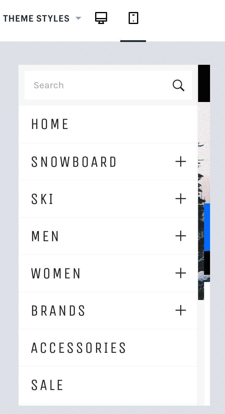
As a Shopify user, this one will be easy. Shopify store themes (both free and paid themes) have a responsive design and an ecommerce checkout system designed for mobile users. A responsive design is one that shifts elements of your website to fit any size screen. You can see how this works when browsing Shopify themes by using the toggle at the top to see both the desktop version…

Followed by the mobile version.

As you can see in the above images, the store’s design maintains the same look and feel for desktop and mobile users. Elements like the menu for mobile users just shifts from the top of the website to the collapsed menu bars at the top left.
Responsive designs are preferred by Google as the best way to make sure your website is user friendly for visitors using any device. This is primarily because the user experience is consistent for everyone and because there are no pages that are mobile-only. Desktop and mobile users visit the same URLs to access the same content, regardless of device. This makes it easier for search engine crawlers to keep track of and index the pages on your website for desktop and mobile search users.
Shopify themes typically have a fast load times, which means that you don’t have to worry about the integrity of your Shopify store’s site speed at the start. But it is something you need to be aware of as you add new content to your website – especially media elements like images.
Let’s say that you are adding new images to your product pages. It’s important to make sure your images do not have large file sizes. Otherwise, they will slow down the time it takes to load any page those product images appear upon, including pages they appear upon as thumbnails (such as your homepage, collection pages, and internal search results pages).
In most cases, you can resize your images on your computer. The easiest ways to do it is to shrink the image resolution and quality. Mac users can use the free Preview app to adjust the resolution (width and height) of the image using the Adjust size option under the Tools menu. This will show you the before and after file size of your image based on the resolution you choose.
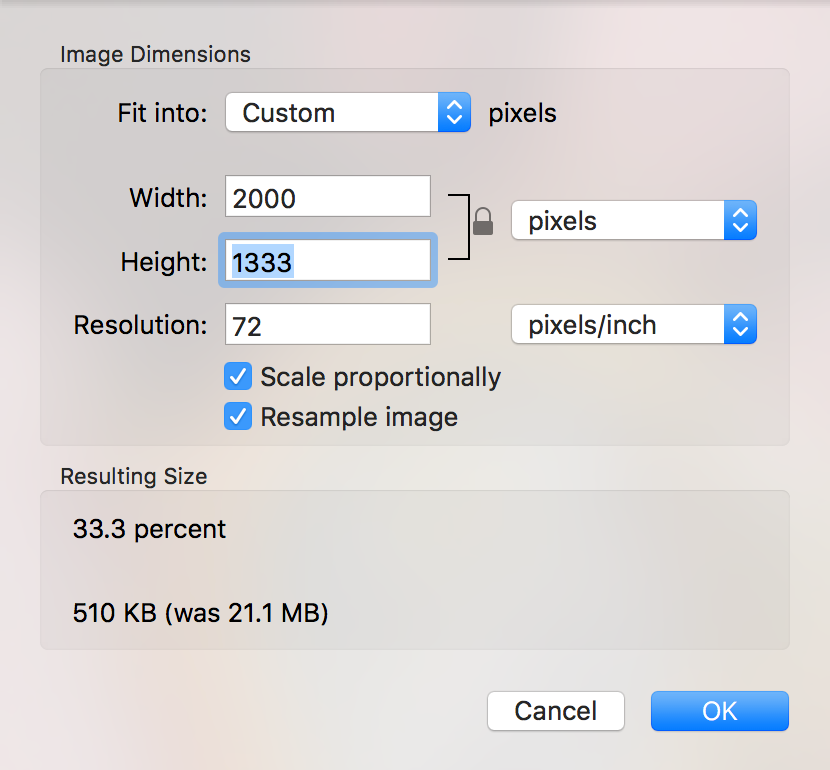
Above, you can see how a change from 6,000 x 4,000 pixels to 2,000 x 1,333 results in a reduction in file size from 21.2 MB to 510 KB. After you modify the resolution of your image, you can export the image to JPG and modify the quality of the image to further reduce the file size.
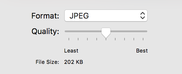
Above, you can see how a change in quality by sliding the scale from Best to midway further reduces the file size from 510 KB to 202 KB. While it may not seem like much for one image, if you have five images on a page, it reduces the total file sizes of those images from over 100 MB to 1 MB. This will help your page load much faster.
Giles Thomas
CEOOptimize your Shopify conversion rates. 5 lesson course, learn 51 ecommerce best practices to get more visitors to buy.